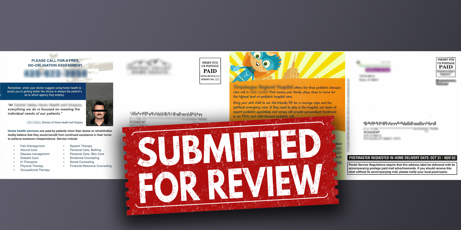
Good marketers can learn from the promotional activities of other medical practices. Whether the marketing we see is good or bad, there’s always something to learn.

Pediatric Intensive Care Unit Awareness Campaign
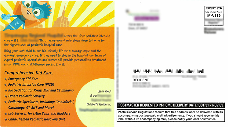
Recently, I received a postcard in the mail from a hospital advertising their pediatric intensive care unit. The postcard was addressed to “Resident”. The paper was thinner than what I expected a postcard to feel like, most likely due to the practice using a bargain printer and mailer. The art was comprised of cartoon superheroes. The colors were bright and attractive.
What’s the problem?
I have no kids in my house! I’m an empty nester. Why am I receiving a promotional postcard for pediatric services? Obviously, the hospital failed to find their target market and, instead, blasted their message to the world.
For every card received by a household like mine, the hospital is throwing dollars to the wind. Still, it doesn’t take many new patients to pay for the campaign, albeit a more targeted approach will significantly improve the ROI.
More importantly, I wonder about the return on this campaign. The objective seems to be purely awareness. I assume that the message is “should you ever be in need of a pediatric intensive care unit, think of us.”
I hope nobody is ever in need of a pediatric care unit, but I would be forever grateful for this service when in need.
Tracking ROI on this type of campaign is going to be tricky, because the end recipient is not known by the hospital. The marketing team could eyeball the ROI, of course, comparing revenues pre- and post-campaign. Using a targeted mailing list will avoid this.

Home Care and Hospice
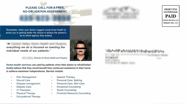
I received another postcard in the mail from a local home health care company. The postcard was addressed to “Resident”. The paper was flimsy; again it appeared the company bought into a bargain deal marketed by a national printer and mailer. The art showed a nurse helping an elderly woman on one side, but the address side had little imagery to capture my attention. A quote and picture from the director of the care center failed to fill me with confidence in their services. Take careful note: If you’re going to include a picture of your team in your marketing, be creative and fun. Stiff portraits are just okay; pictures that portray your team as human and personable are best. The messaging was haphazard and unfocused, albeit it touched on all the services and benefits the care center offers.
I have to assume the care center targeted me because I’m at an age when I may be looking for assisted care for my parents. If that’s the case, why would they address the postcard to “Resident” rather than to me?
A better guess is they failed to do their research and mailed to everyone. As in the previous example, this campaign could have a much stronger ROI by doing a little more homework.
If you have a sample you’d like to share, send it to andy@relevantmd.com.
